Feedback report
Feedback Survey
https://www.surveymonkey.com/s/P385KDZ
Ident bumper 3
Like my other Ident's i wanted to have something that was considered a British stereotype or a landmark that most people will know. I chose to have a London Cab because I believe that is a simple way to add motion into the Ident. The black does not particularly stand out to the viewer but the bright red draws the audiences attention so they immediately know what they are watching. Because the Ident is only 25 fps I wanted to keep it simple but have a background the is easily noticeable and recognizable
To Improve this Ident I would start with the Taxi already in shot so it gives more time for the viewer to see the logo. I would of also animated the wheels to spin to make it look more realistic.
To Improve this Ident I would start with the Taxi already in shot so it gives more time for the viewer to see the logo. I would of also animated the wheels to spin to make it look more realistic.
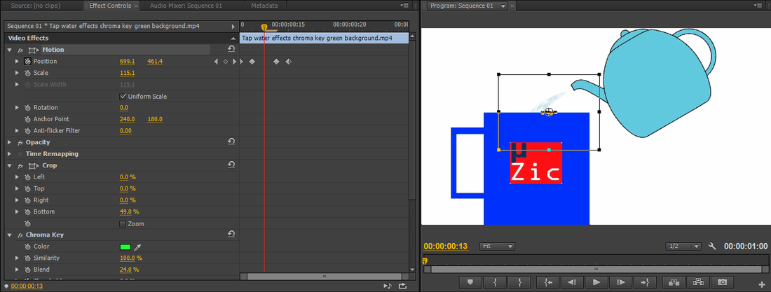
Ident Bumper 2
For this Bumper I wanted to keep it simple. this is because it was only 25 FPS so I wanted the viewer to be able to see the logo in shot and not be distracted by other things happening. I chose to have a kettle pouring water into a cup of tea because this is a very stereotypical British thing to do. One thing I wanted to have was actual water being poured in the shot to add a sense of realism. After some thinking I had a look on YouTube and found pouring water with a green background which allowed me to key it out. I used the editing software to then track the water just as it was being poured.
To Improve this i would add more attention to detail on the mug and improve the quality of the logo. I believe this will make it more visualizing pleasing and less amateur. I would also try out different ways to include water, although I am happy with it I think that their is away on flash to do it which I am yet to discover.
To Improve this i would add more attention to detail on the mug and improve the quality of the logo. I believe this will make it more visualizing pleasing and less amateur. I would also try out different ways to include water, although I am happy with it I think that their is away on flash to do it which I am yet to discover.
Ident Bumper 1
I wanted to move away from London for this Ident but have somewhere that is well known. I used Stonehenge as its an extremely popular attraction, and it doesn't stand out which means the viewer is more likely to notice the logo. After finding this picture i wanted to find a quick way for the logo to come onto the screen. I chose to use a plane because I can make it fly in quickly which means I can leave it on screen for longer. The bright yellow immediately draws the viewers attention so that they know what they are watching.
To Improve this Ident I would of animated the propeller on the plane so that it looks like it is spinning. To make it look more realistic I would of also had the logo have a slight bit of motion so it looks as if the wind is making it move.
To Improve this Ident I would of animated the propeller on the plane so that it looks like it is spinning. To make it look more realistic I would of also had the logo have a slight bit of motion so it looks as if the wind is making it move.
Ident r'n'b
For this Ident I still wanted to keep the train to indicate to the viewer that is a British music channel. I chose to have the logo on the train like with the generic one but so it looks like graffiti. I believe that this fits in with the R'n'B stereotype. To make it look like the Ident was for R'n'B i chose to have a man on the platform bobbing his head to music with a boombox next to him. I wasn't originally going to have him moving his head but once i learnt how to move the head I felt like it made it more interesting for the viewer.
To improve this Ident I would add tiles on the background to make it look more realistic. I would also have someone getting onto the train so you can see them in the window bobbing their head.
To improve this Ident I would add tiles on the background to make it look more realistic. I would also have someone getting onto the train so you can see them in the window bobbing their head.
Ident Punk weekend
Like the R'n'B Ident I wanted to keep the train as it is a easy way for me to show the viewer that it is a British based music channel. When I was looking for music I found music that I thought really suited it. I then came to a realization that they weren't British bands. I chose an instrumental version of London's Calling by the Clash because it is a popular Punk song and because it is so well known it will draw the viewers attention to the screen. Similar to the man in the R'n'B one i wanted to add some animation. I chose to have the man strum the guitar to the song, this worked better than I expected and makes it more interesting to watch.
One way that i would improve this Ident is by having the man in the window of the train do the punk hand symbol to make it more engaging to watch. I would of also changed the logo on the side of the train to a different font to make the typography more appealing and more suiting to the music genre.
One way that i would improve this Ident is by having the man in the window of the train do the punk hand symbol to make it more engaging to watch. I would of also changed the logo on the side of the train to a different font to make the typography more appealing and more suiting to the music genre.
Ident Generic
I wanted to make this Ident simple so it did not distract the viewer from the logo on the train. I used the London Underground because that is a thing that most British people know and gives a good representation of the intended audience. The moving train allowed me to have the logo come in smoothly, stay there then leave when the train leaves. It is large on the screen so it is easily noticeable to viewers.
To improve it I would try and find some white tiles for the background to add to the image of it being the undeground. I would also animate the man to have a cup of tea is his hand to add to the British stereotype and make it more humorous .
To improve it I would try and find some white tiles for the background to add to the image of it being the undeground. I would also animate the man to have a cup of tea is his hand to add to the British stereotype and make it more humorous .
