DvD cover analysis
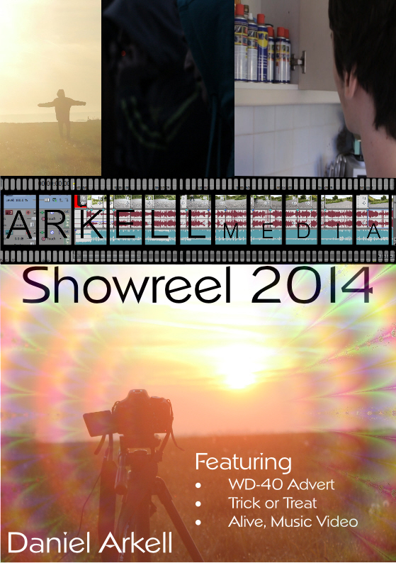
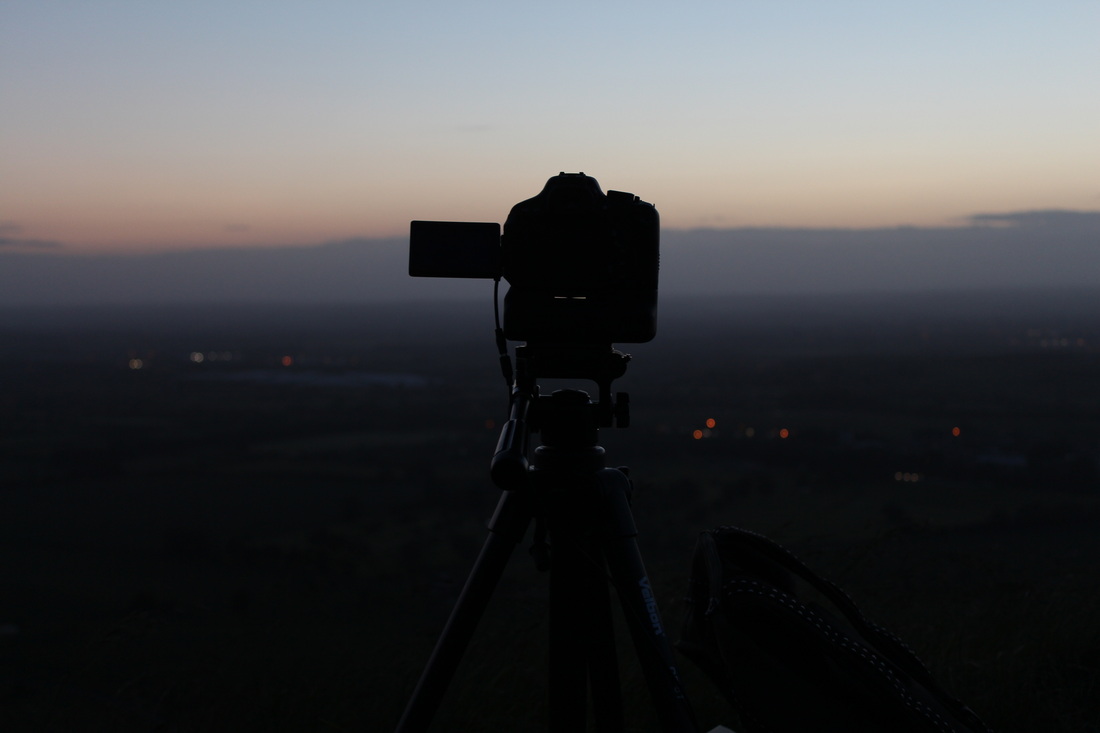
I am fairly happy with how they come out after I was trying to find pictures that I believe would work for it. To get the best quality screenshots I could I went into the editing software and snapshot a single frame meaning their is less motion blur. I decided to use the two pictures from the time lapse in the end. The sunrise one on the front cover because it has bright colours and will stand out to people. I used the sunset one on the back because it is darker and easier to write text over because the colours will not distract the person reading. It also worked because I could base the writing around the camera which gave it a nice touch and let me play around with ideas. I used some sort of illusion type thing over the top on the front cover to make it stand out and give it the bright and happy style I was going for. I chose this text because I found it quite bouncy and fun but it also looks quite professional which is what it needs to be. On the front cover I out my production name on the front in the middle. This allows for a good divider between the set of pictures at the top and the sunrise underneath, but the main thing is that it clearly tells people who I am.
To improve the DVD cover I would probably used more effects and play about with different designs to give it a more professional look. One thing I would do in the future is cut the different images at the top diagonally. This is because it makes it unique and fits the style a lot better in my opinion.
To improve the DVD cover I would probably used more effects and play about with different designs to give it a more professional look. One thing I would do in the future is cut the different images at the top diagonally. This is because it makes it unique and fits the style a lot better in my opinion.
DVD Back cover
DVD front cover
Booklet Analysis
In my booklet i did not use all of the pictures I intended to use. This was simply because I did not have enough space in the booklet and if I did try and cram more photos in it would look unprofessional and not to the standard that I would want it. I included a brief description about myself at the start so that people get to know who I am and have included contact details so people can easily find me. I did not use bright colours in the actual booklet because I find that the viewer may find it distracting which means they will most likely not read it. Although I still think I will use bright colours on the cover to draw peoples attentions.
Final booklet
PdF version
| photography_dvd_cover.pdf |
Pictures to be included

Idea development
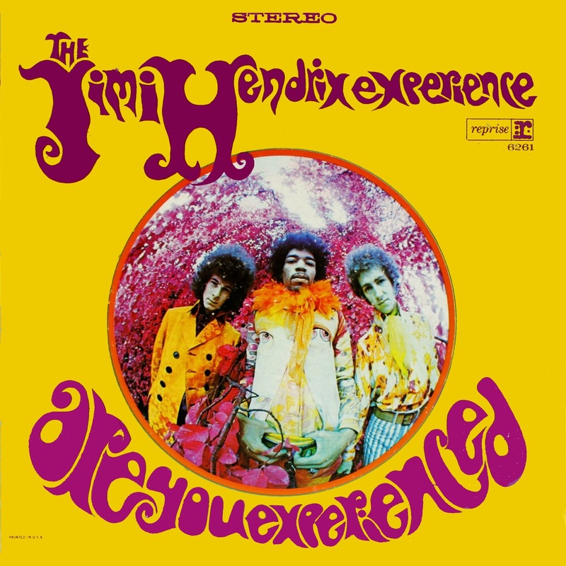
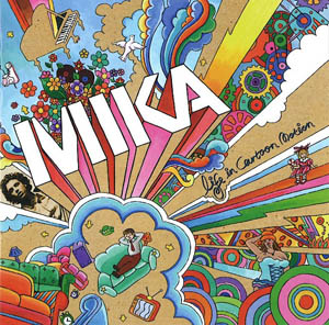
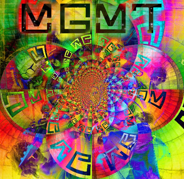
I enjoy the psychedelic colours used in these album covers. If you see these on a shelf they will stand out to you immediately making most people go over and have a look. People may also like it because it is unique and different to others which is what I want my work to be like. On Mika's album cover I like the cartoon 3D effect that he is going for because it stands out well and shows people what he is like as an artist. On Jimi Hendrix's album cover he is photographed with a fisheye lens which indicates his slightly unusual and wacky side. It is an extremely simple album cover but has great effect because of the bright Purple writing and yellow background.